Hackpad:
Brand & Product
Nov 2013 - Apr 2014
ROLELead Product Designer
Lead Mobile Designer
Lead Brand Designer
Pioneering collaborative documents for the web
In the early 2010s, docs were old school.
The state-of-the-art was Google Docs, modeled closely after Microsoft Word. It offered a billion formatting options, but no way to embed rich web content. It had multi-user editing, but no easy way to see who wrote what, especially in real-time.
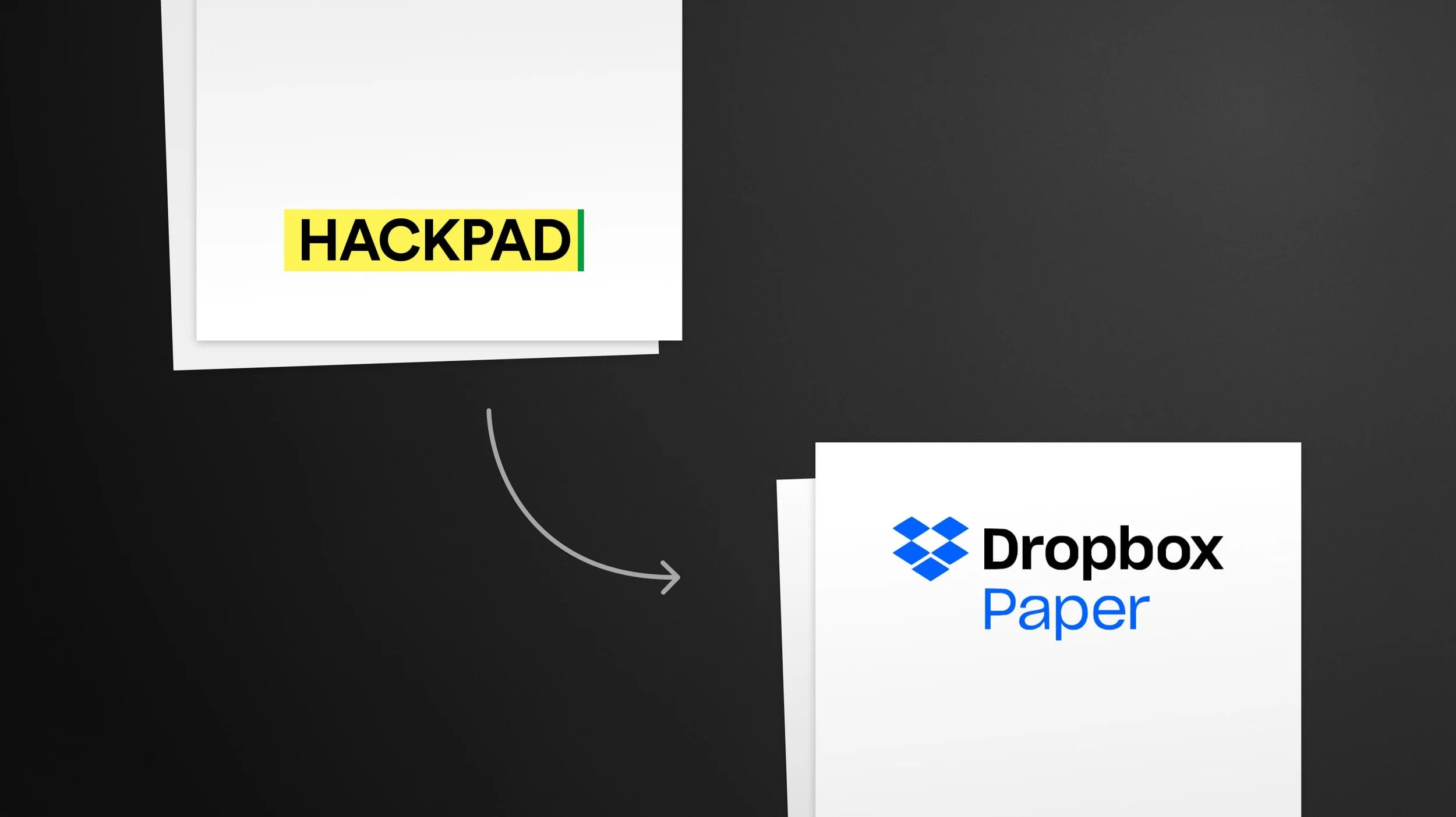
The first version of Hackpad was a revelation: docs that felt fast, simple, and native to the internet! I was recruited to design the second version (and the first mobile app), just before it was acquired and transformed into Dropbox Paper.
In addition to pushing Google Docs to adopt many of the same features, its UX likely inspired the latest crop of doc platforms, such as Notion, Coda, Roam, and Craft.
Evolving the User Experience & Interface
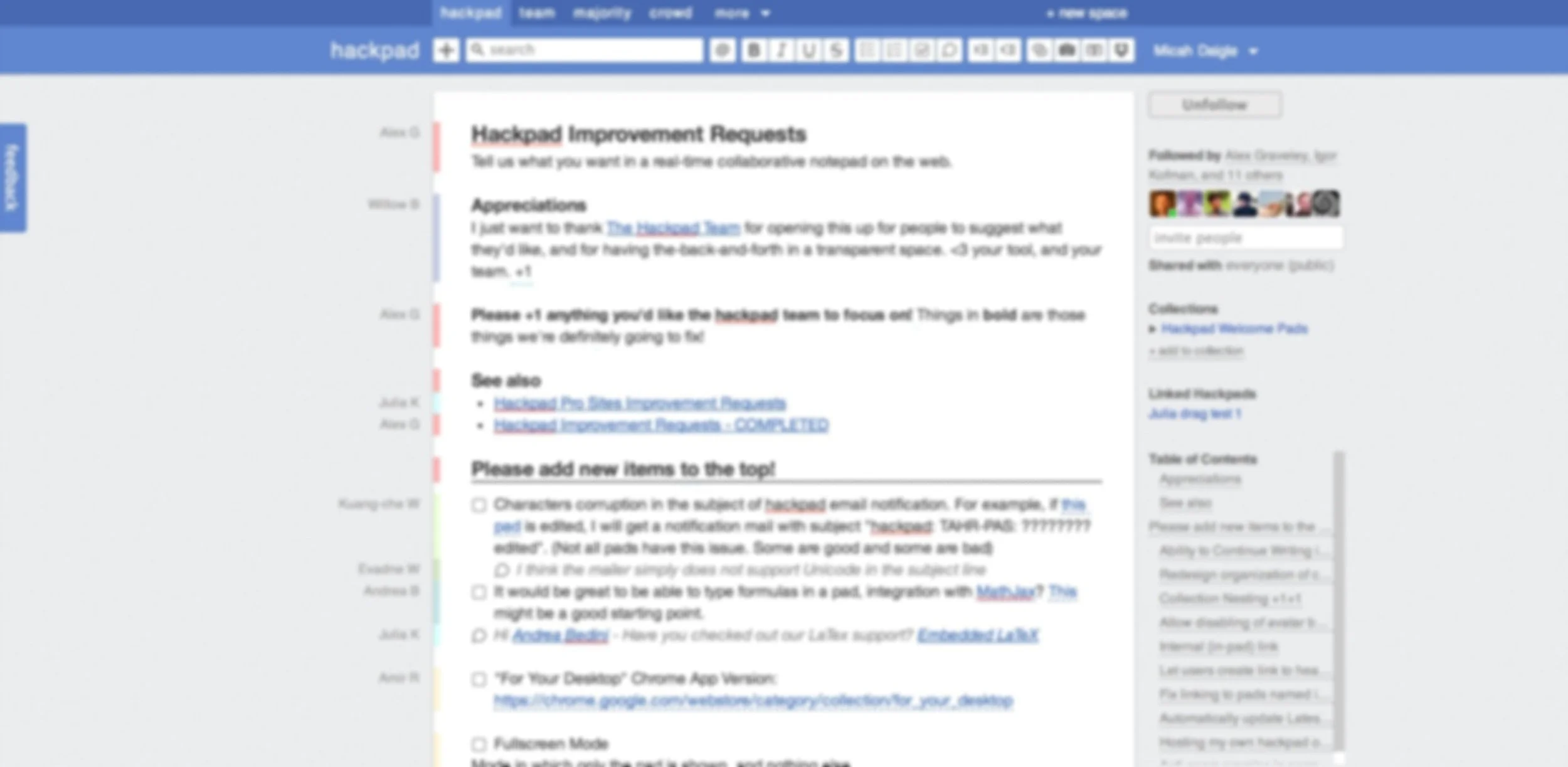
The starting point
The original UI was functional, but many users found it cluttered and overwhelming.
It also had a bland look, similar to Facebook at the time. In short, it felt kind of hacky.
Stripping it down
By applying typographic hierarchy and minimal design, I made the docs cleaner and clearer, without losing functionality.
A key aspect of this was creating Read Mode, which hides the editing UI until the user clicks into the document.
More UI when you need it
Clicking into the document activates Edit Mode, revealing a formatting palette, edit history, and the presence of users editing the document in real-time.
💡 While real-time presence is now commonplace in tools like Figma and Miro, Hackpad pioneered this feature.
A feed for your work
I designed a homepage feed of recent changes to documents you’re following.
Instead of opening dozens of tabs from notification emails, users had a clear view of everything they needed to review.
Search within documents
To this day, searching web docs is very limited. (e.g. Google Docs gives a simple list of docs containing the search term.)
I designed a search page that not only pulls up docs that contain the term, but also the context that the term exists in.
Show, don’t tell
I designed a homepage that allows you to start using a Hackpad instantly, without even needing a user account.
As you typed, a bot would edit the doc with you, showing how it works in real-time.
Dialing up the minimalism
While the new UI was a big improvement, it still felt too cluttered to me. I wanted each doc to feel like a fresh sheet of paper.
This design was shelved due to concerns about it being too simple, but it forecasted the eventual design of Dropbox Paper.
Docs in your pocket
In additional to redesigning the entire web product, I also designed Hackpad’s first native mobile app, which was the top request of users.
Bringing the magic of the product into brand and marketing
After redesigning Hackpad, I began a branding process that sadly wasn’t launched due to the acquisition by Dropbox.
The leading concept would bring the magic of real-time editing into public awareness in a novel way.

Edit the world
The concept was to build the brand around the idea that everything is editable. Including the billboard right in front of you.
Digital billboards were becoming more commonplace in the early 2010s, so this brand concept suggested a fun marketing campaign: passersby could edit the ad directly on their phone, which would sign them up for the product.

A moderated whiteboard
Obviously, allowing anyone to edit a billboard without any filters could result in abusive/obscene messages. So the idea was to put the edits on a slight delay, and have a moderator approving edits before they went live.
♥
“The look and feel of Hackpad at the time Dropbox acquired us is entirely thanks to Micah. He quickly wrapped his head around a complex product and came up with novel solutions that our users loved. An absolute pleasure to work with.”
Igor Kofman
Founder, Hackpad